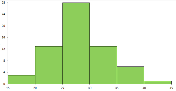
A Histogram is used to represent the data of a variable over a continuous interval. It is a precise display of the distribution of a set of continuous numerical data. Histogram was first introduces by Karl Pearson. It looks similar to bar graph but is different in sense that bar graph display values for 2 different variables and histogram relates to only one variable. A histogram unlike bar graph shows no gaps between the bars.
Steps to Draw Histogram
- Divide the entire range of values into series of intervals called bins.
- The bins must be of equal size and adjacent.
- Choose the correct bin width.
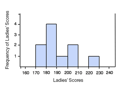
Example: To create a histogram displaying the top ten women’s figure skating scores for the 2010 Winter Olympics.
| Yu-Na Kim | 228.5 |
| Mao Asada | 205.5 |
| Joanie Rochette | 202.64 |
| Mirai Nagasu | 190.15 |
| Miki Ando | 189.1 |
| Laura Lepisto | 187.97 |
| Rahail Flatt | 182.49 |
| Akiko Suzuki | 181.41 |
| Alena Leonova | 172.43 |
| Ksenia Makarova | 171 |
We should plot the frequency of each interval: 2 between 170-180, 4 between 180-190, 1 between 190-200, 2 between 200-210, and 1 between 220-230.
Rate this Article: 

 (113 votes, average: 1.48 out of 5)
(113 votes, average: 1.48 out of 5)