A scatter plot uses dots to represent data obtained from two different variables, one of them is along the x-axis and the other one along the y-axis. It represents that how much a variable is affected by another variable. Scatter plots are commonly used when we want to represent the relationship between two variables. The relation between the two variables is known as correlation.
Steps to Draw Scatter Plot
- Collect the required data.
- Determine which factor to be shown on x-axis and which factor to be shown on y-axis.
- Set the minimum and maximum values for each factor.
- Label the graph with title for the x and y axis.
- Start marking with the lowest value from the bottom left corner of the graph.
Example:
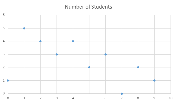
The scatter plot below shows the number of hours per week the same group of 25 students reported spending on homework.
| Hours Spent on Homewrok | Number of Students |
|---|---|
| 0 | 1 |
| 1 | 5 |
| 2 | 4 |
| 3 | 3 |
| 4 | 4 |
| 5 | 2 |
| 6 | 3 |
| 7 | 0 |
| 8 | 2 |
| 9 | 1 |
Correlation
When two different sets of data shows a relation between two variables it is known as Correlation. There are two types of correlation:
Positive correlation: When both the variables move in some direction it is known as positive correlation. As one variable increases the other variable also increases.
Negative correlation: When variables move in opposite direction it is known as negative correlation. As one variable increases the other variable decreases.


 (118 votes, average: 1.52 out of 5)